Practicing Accuracy
##Practicing Accuracy
###Example: City Permits A new city manager wants to promote economic development by dramatically increasing the number of building permits issued by the city’s Department of Consumer and Regulatory Affairs. The department normally churns out almost 3,500 permits a year or just under 300 a month; but the city manager believes there is slack in the system. Halfway through the year, he announced a target of issuing 5,000 permits before year’s end. No one is sure where the number 5,000 came from, but you have all the permit data, so it is time to check the target against the facts.
####Step One: Identify your actual performance from the same time time last year. Take a look at the historical data for permits:
January
350
368
386
405
February
325
341
358
376
March
337
354
372
390
April
256
264
272
280
May
247
254
262
270
June
216
222
229
236
July
175
182
275
TBD
August
150
156
225
TBD
September
167
174
275
TBD
October
350
371
393
TBD
November
375
398
421
TBD
December
345
366
388
TBD
Quick Tip: Practice yourself by copying and pasting everything in the table to an Excel spreadsheet. (Just remember to clear the "To Be Determined (TBD)" cells, since they are not real numbers).
####Step Two: Generate the summary statistics about past performance. From this quick look, you can do rough calculations to gauge whether the target is achievable if the department maximizes performance. If the department operated at maximum proven capacity (421 permits a month) for the remaining six months, it would issue a total of 4,483 permits for the year, still short of the city manager’s goal. But the department keeps getting better every year – the minimum, average, median and maximum keep increasing – so maybe there is room for dramatic improvement.
2012
3,293
150
274
291
375
2013
3,449
156
287
302
398
2014
3,856
225
321
317
421
2015 (YTD)
1,957
236
326
328
405
Quick Tip: How to Generate Summary Statistics This is not an exhaustive list of descriptive statistics, but it is enough to get started.
Sum: To calculate the Total Permits issued each year, simply add each cell together for each year. The quick way to do this in Excel is to use the "Sum" Function, which should look something like this for 2012: =SUM(B2:B13). In this Excel formula, "SUM" is a function that adds everything in parentheses together, B2 is the data for January 2012, B13 is the data for December 2012; and the colon means "everything in between."
Minimum: The quick way to find the Minimum number of permits issued each year is to use Excel's "MIN" Function, which should look something like this for 2012: =MIN(B2:B13). In this formula, "MIN" is a function that finds the smallest data point between everyting in parentheses.
Average: An average (or "mean") is the sum of a list of numbers divided by the number of numbers in the list. In this example, it is the sum total of permits issued for each month of the year, divided by 12 months. The quick way to find the average number of permits issued each year is to use Excel's "AVERAGE" function, which should look something like this for 2012: =AVERAGE(B2:B13). In this formula, "AVERAGE" is a function that adds everyting in parentheses and divides it by 12.
Median: The median is the point in your dataset that separates the larger 50% from the smaller 50%. For example, if I have numbers 1 through 10, 5.5 is the Median because 50% of the values are higher and 50% are lower. The quick way to find the Median number of permits issued each year is to use Excel's "MEDIAN" Function, which should look something like this for 2012: =MEDIAN(B2:B13). In this formula, "MEDIAN" is a function that sorts all of your data from smallest to largets and then finds the midpoint.
Maximum: The quick way to find the Maximum number of permits issued each year is to use Excel's "MAX" Function, which should look something like this for 2012: =MAX(B2:B13). In this formula, "MAX" is a function that finds the largest data point between everyting in parentheses.
####Step Three: Confirm all trends and anomalies It seems clear from the basic descriptive statistics that the 5,000 permit goal is improbable, but year-over-year improvement makes it seem possible. Because summary-level statistics can often mask the underlying dynamics, it is time to confirm all trends and anomalies. Plotting the data in a chart is an excellent way to spot both.
#####Figure 7 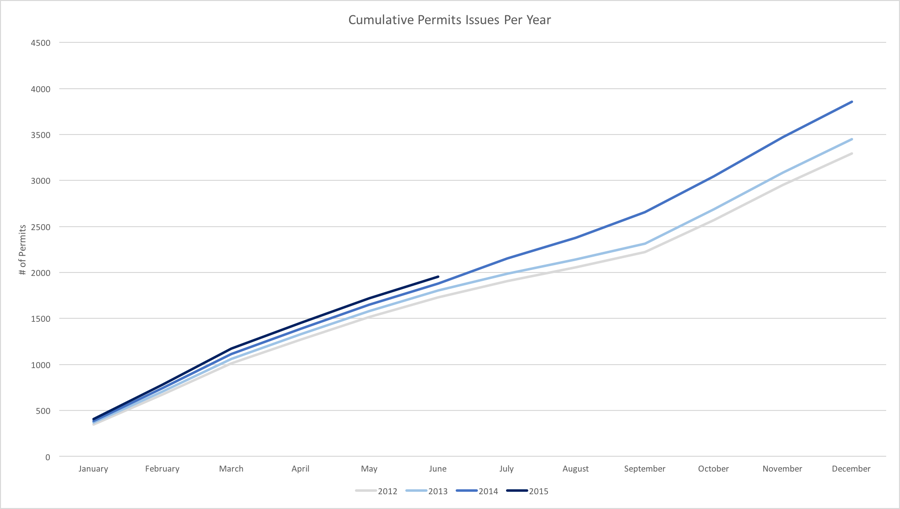
Quick Tip: Generating a Cumulative Chart
The original data in this example is discrete, where each month is independent of the other months. However, it is useful to convert discrete data to cumulative data by adding each month's total to those that came before. A quick way to do this in Excel is to make a copy of the original data and use formulas to create cumulative totals based off the original. For example, set January 2012 (copy) equal to January 2012 (original). Then set February 2012 (copy) equal to (January 2012 (copy) + February 2012 (original)). From there, autofill the rest of the cells to create a cumulative table. With a new cumulative data set, creating a cumulative chart is as simple as highlighting the data and inserting a line chart.
In the example above, improvement has been sustained every month for the past three years. However, it also seems September to December is one of the most productive times of year. So a key question to ask: “is productivity increasing at an increasing rate?” If so, there may be reason to hope 2015 will be even more productive than 2014. Changes in productivity can be assessed by calculating the slope (rise/run) of a line: the change in permits issued across time. Changes in productivity for September through December are calculated in the table below, which makes it clear productivity has continuously increased at an increasing rate. Therefore, it might be reasonable to assume we will come closer to the 5,000 permit goal through a natural annual increase in productivity for the remaining months.
Rise (Change in Permits)
1,070 permits
1,134 permits
1,202 permits
Run (Change in Time)
3 months
3 months
3 months
Change in Productivity (Rise/Run)
357 permits/month
378 permits/month
401 permits/month
However, since 2014 seems to behave differently than prior years, it is important to learn whether the increase in permits was an anomaly. Cumulative charts can sometimes hide the trends by month, so create a monthly view to spot any differences at a more granular level. In the monthly chart below, July, August and September were all clear anomalies in 2014. How big were the anomalies? July bucked the trend of decreasing permits from previous months and beat the previous July average by 53%. Avoid building targets based on potential anomalies.
#####Figure 8 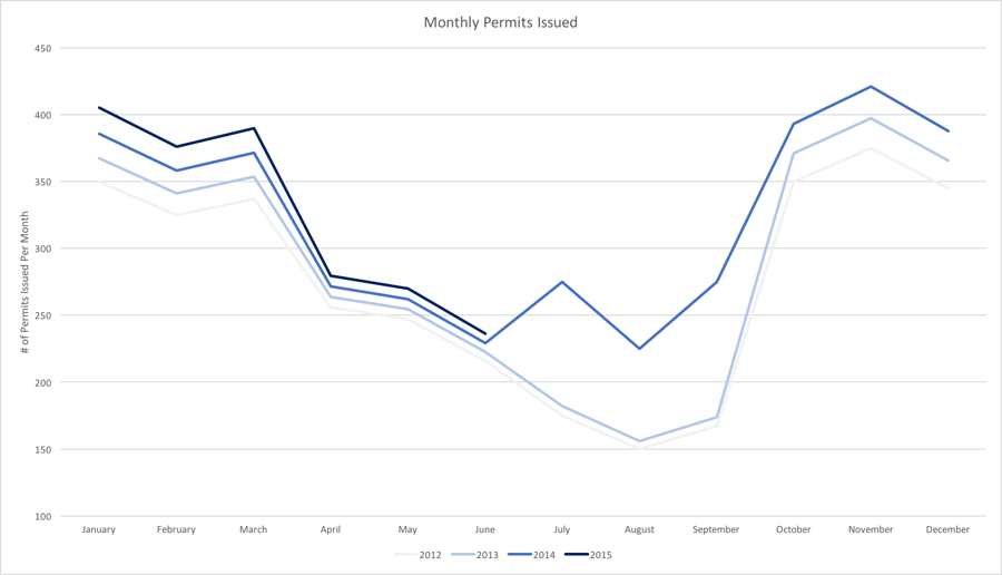
####Step Four: Show (don’t just tell) what it would take to reach the overconfident target At this point, you know the following:
the department keeps getting better every year (i.e. the minimum, average, median and maximum keep increasing every year); however,
if the department operated at maximum proven capacity for the remaining six months, it would still short of the city manager’s goal; and,
it is unreasonable to assume a natural increase in productivity for the remaining months because productivity varies by month; Perhaps the City Manager will be persuaded toward a more reasonable target based on this information alone. However, it is better to show than tell. Create a chart which plots historical performance against the overconfident target, showing how the department would have to perform in order to reach the desired target. The overconfidence will be obvious.
#####Figure 9 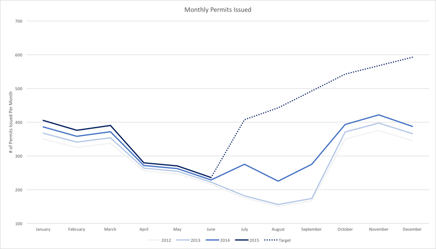
To reach the City manager’s target, the department would have to perform better than maximum proven capacity for each remaining month; beat last July’s performance by a significant margin (which was already an anomaly from previous years); and would have to sustain an increased rate of productivity (which is abnormal for the months of August and December). Without a change in the way permits are issued, 5,000 permits in one year is an impossibly high target.
####Step Five: Find a middle ground. The reasonable city manager, persuaded by the statistics, will likely want to find a compromise target: one that inspires improvement while accounting for reality. To find the middle ground, you do a few simple things:
assume the anomaly was an anomaly: ignore it until proven otherwise
assume productivity will follow the same overall pattern from month to month
apply an increased productivity factor to the performance each month
#####Figure 10 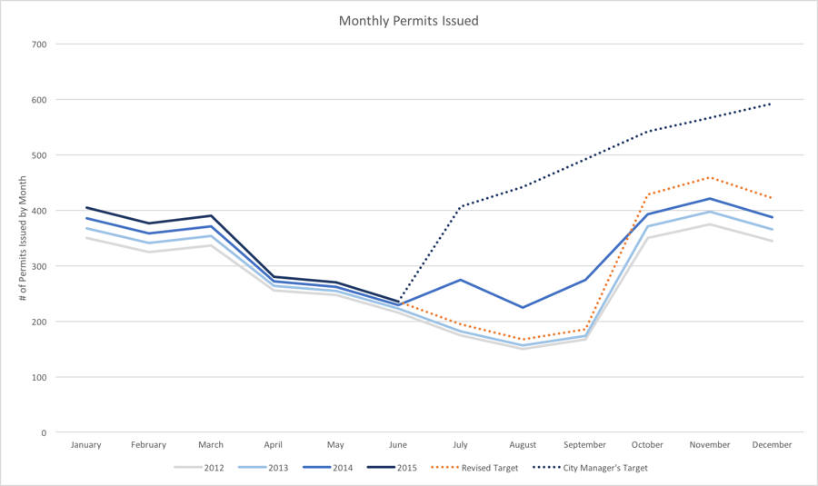
In this example, the revised forecast assumes a 3% increase in productivity for each remaining month, but applies the factor to the 2013 totals in July, August and September (to account for the anomaly in 2014) and then applies the 3% productivity increase to 2014 totals for the remainder of the year. The end result: the cumulative target for 2015 is 11% higher than 2013 and is based on a historically accurate productivity pattern. The target falls within 1% of 2014’s actual performance, which has a few months discounted as anomalies. If July’s performance mirrors 2014, the entire target for 2015 can be easily readjusted.
#####Figure 11 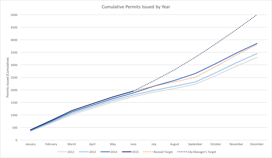
Last updated